
A kitchen is looked at, touched and cleaned more than any other room, so the colour decision carries more weight than it seems in a showroom. Two-colour laminate schemes have become the norm in Indian modular kitchens because they solve a real problem: one colour looks flat under a single window and tube lights, while three or more start to look busy. Two, chosen well, give depth and balance.
Why two colours work better than one
Most apartment kitchens in India have one window and one overhead light. A single colour absorbs that light evenly, and the upper and lower cabinets merge into one block. Splitting the colours fixes this with almost no cost:
- A darker base sits where grease, water and feet are, and hides wear.
- A lighter top reflects light onto the counter and makes the ceiling feel higher.
Getting the proportions right
Designers often use a 60-30-10 split: about 60% of the visible surface in the main colour, 30% in the second colour, and 10% in an accent such as handles, backsplash or lights. In a kitchen that usually means:
- Main colour (about 60%): wall units, tall units and lofts. This is the colour people will describe your kitchen by.
- Second colour (about 30%): base units and the island. This is the anchor.
- Accent (about 10%): handles, backsplash, pendant lights or one feature door.
An equal 50:50 split tends to look undecided. In very small kitchens (under about 80 sq ft), go 70:30 with the lighter colour leading. In an open kitchen, repeat the main colour, or something close to it, somewhere in the living room so the spaces feel connected.
Four questions to answer before you look at swatches
1. How much daylight does the kitchen get?
Stand in it at about 11 am with the lights off. If you can read a recipe comfortably, dark combinations are open to you. If you reach for the switch, stay with the lighter pairs.
2. How big is it?
Under 80 sq ft is small, 80–140 sq ft is medium, above 140 sq ft is large. Small kitchens carry one calm mood well; large kitchens can take contrast. Deep colours in a small kitchen rarely feel luxurious; they feel tight.
3. What is the countertop?
Stone is not neutral. A white quartz with grey veins pulls the scheme cool; black granite warms woods towards orange. Choose the countertop first, or choose laminates knowing exactly what it will be.
4. How much do you cook?
Gloss laminates show every fingerprint within days of daily tadka. If the kitchen works hard, favour matte and textured finishes, and expect colours to look slightly different in each finish.
Ten combinations that work
Each card shows the two colours, a simple illustration of how they sit on the cabinets, and approximate hex codes to take to a laminate dealer. Treat the size and light notes as a filter: if your kitchen does not match, move on to the next.
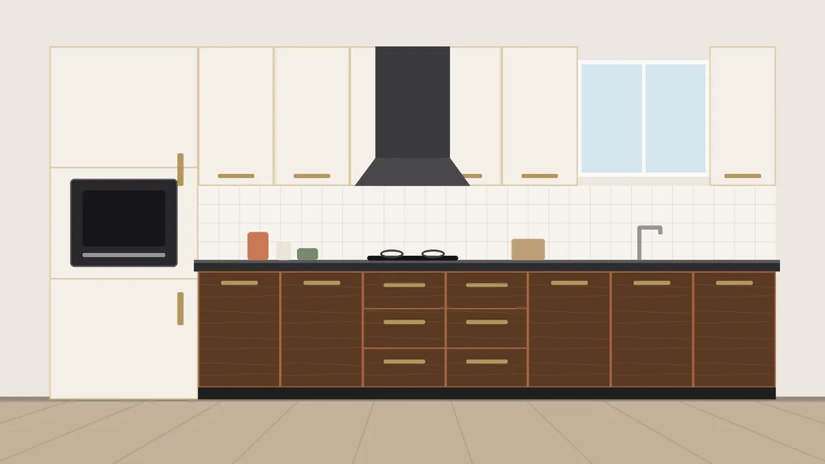
Warm white and walnut wood
Warm white uppers over walnut-grain lowers. It feels finished without trying, works with almost any countertop and resells easily.
- Hides everyday marks on the lower run
- Pairs with granite, quartz or wood-look tops
- Unlikely to date
- A white with a yellow undertone can look tired
- Wood-grain quality varies a lot; see it in person
- Can feel safe if you want a statement
- Kitchen size
- Any
- Daylight needed
- Low to medium
- Style
- Classic, transitional
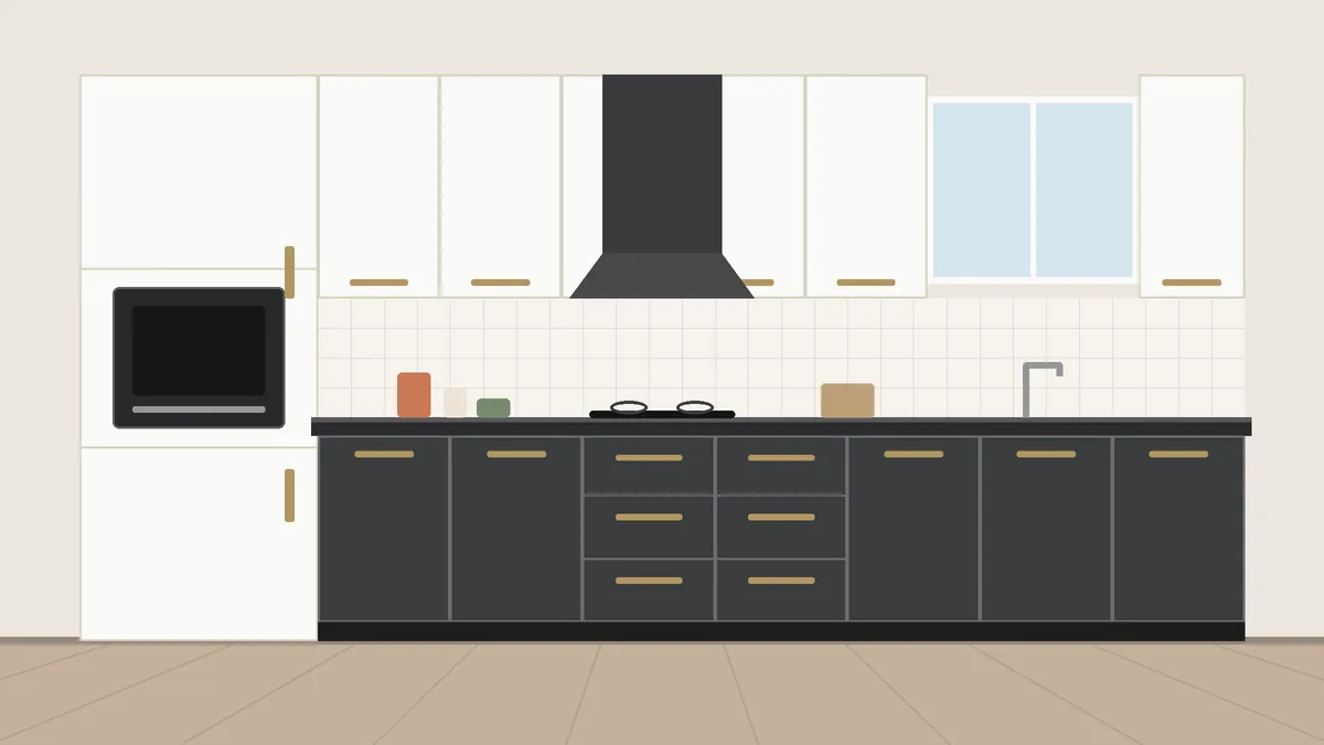
Chalk white and graphite grey
The default modern kitchen for a reason: bright uppers keep the room open, and dark grey lowers take the scuffs.
- Works with stainless steel and white quartz
- Looks sharp in photos
- Easy to refresh with new handles
- Pure white shows turmeric quickly
- Needs wood or brass to avoid feeling cold
- Very common
- Kitchen size
- Medium to large
- Daylight needed
- Any
- Style
- Modern, minimal
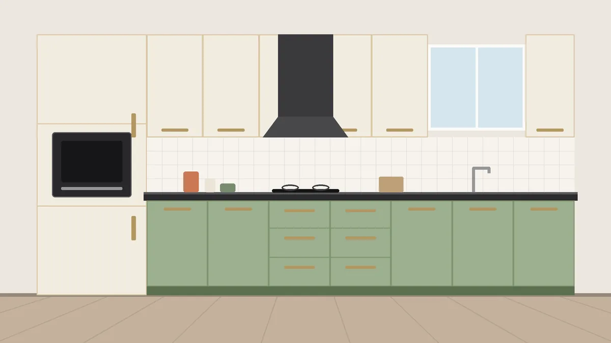
Ivory and sage green
For anyone tired of white and grey but not ready for strong colour. Calm, distinctive, and friendly with brass.
- Restful, low-contrast palette
- Lovely with brushed brass handles
- Looks designed rather than standard
- Sage shifts a lot under different bulbs
- Test the actual sheet in your kitchen
- Narrows your later accent choices
- Kitchen size
- Small to medium
- Daylight needed
- Medium to high
- Style
- Contemporary, soft
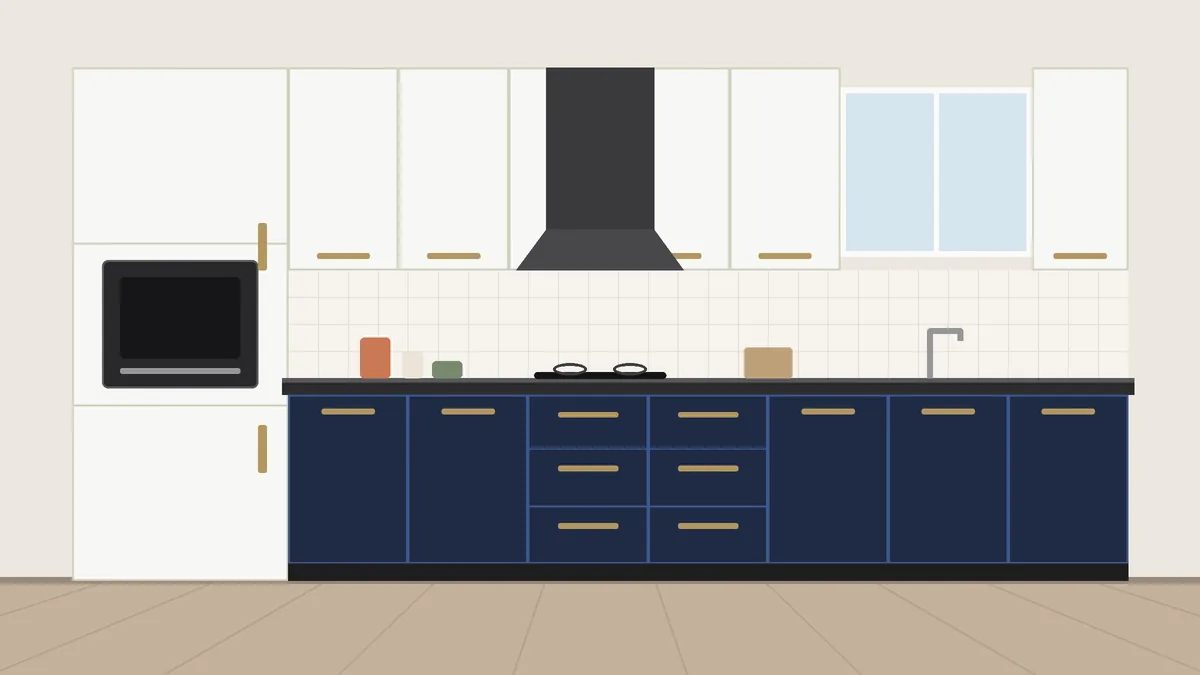
Soft white and ink navy
Navy lowers and soft white uppers, finished with brushed brass. Looks tailored and hides water marks well.
- Dramatic but not loud
- Handles scuffs and splashes
- Pairs with warm wood floors
- Needs good daylight or warm lighting
- Can feel cold in north-facing rooms
- More trend-led than neutrals
- Kitchen size
- Medium to large
- Daylight needed
- High
- Style
- Bold modern
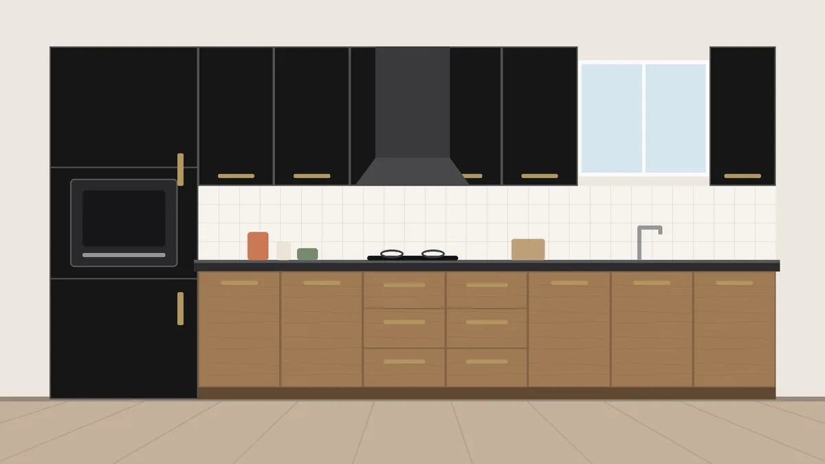
Charcoal black and natural oak
Black tall units or uppers with oak-grain lower cabinets. The wood takes the edge off the black.
- Reads premium and restaurant-like
- Hides steam and splash marks
- Ages slowly
- Needs a bright kitchen, without exception
- Cheap black laminate looks plasticky
- Small kitchens will feel closed in
- Kitchen size
- Large only
- Daylight needed
- High
- Style
- Editorial, hospitality
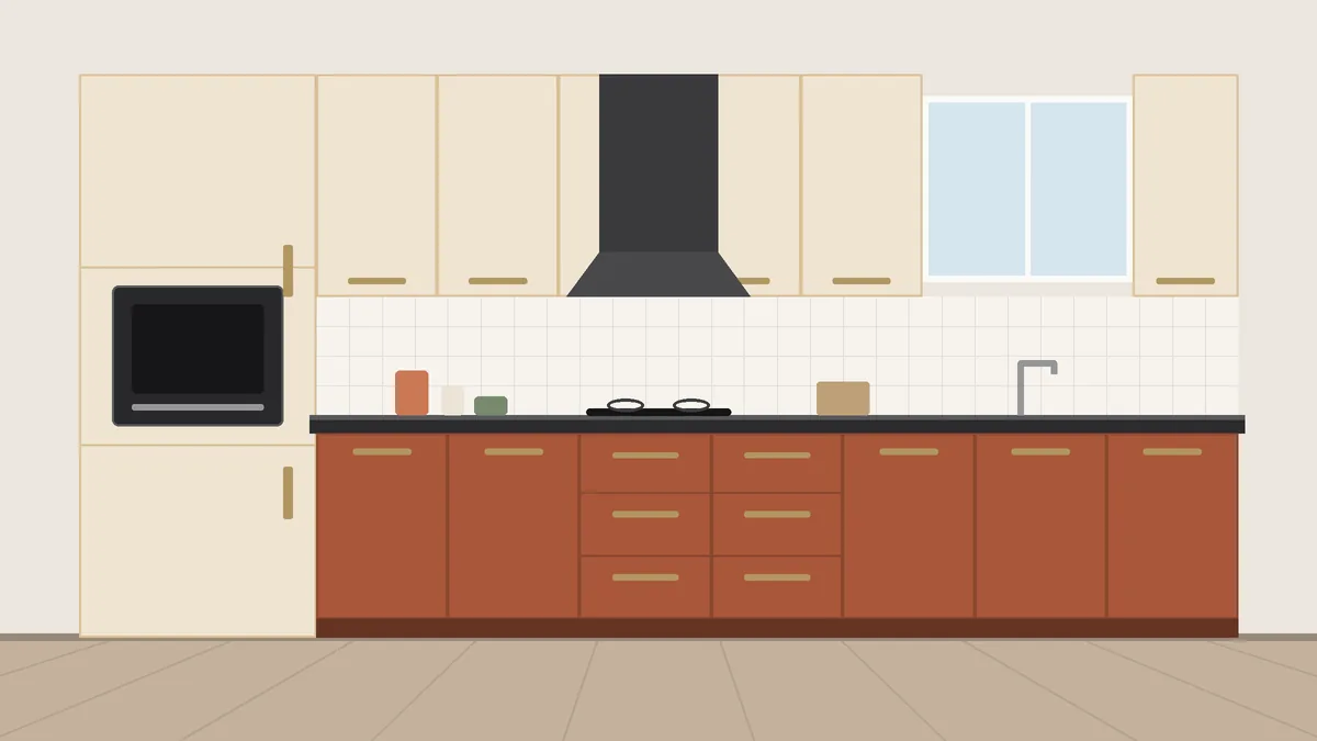
Sand and terracotta
An earthy pair that sits naturally with brass, copper, cane and Indian textiles. Terracotta hides spice stains well.
- Very forgiving of haldi and oil
- Friendly with traditional dining rooms
- Warm under evening light
- Too orange a shade looks dated
- Choose a muted, brown-based terracotta
- Narrower resale appeal than neutrals
- Kitchen size
- Medium
- Daylight needed
- Medium
- Style
- Warm modern, traditional
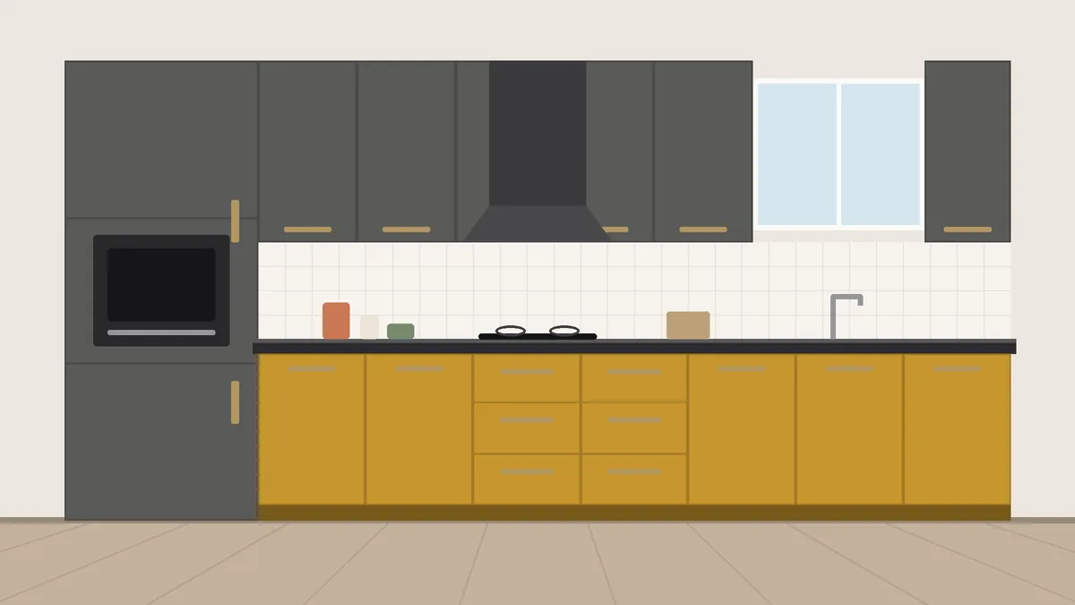
Concrete grey and ochre
Use ochre in a small dose, such as one tall unit or the island, against a grey base. Warmth without the usual wood.
- Memorable and photogenic
- Ochre hides turmeric
- Creative but grown-up
- Avoid bright lemon yellows
- Limits other accent colours
- Too much yellow looks like a café chain
- Kitchen size
- Medium to large
- Daylight needed
- Medium to high
- Style
- Contemporary, eclectic
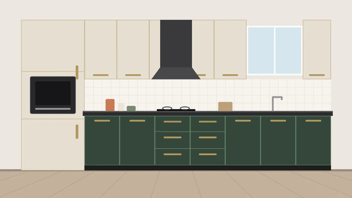
Linen beige and forest green
A deeper, moodier relative of sage. Beautiful with terrazzo or warm-grey quartz and textured finishes.
- Natural and calming
- Hides moderate wear
- Longer staying power than brighter greens
- Needs warm light, not cool white
- Pick a yellow-beige, not a pink-beige
- Looks flat in a smooth finish; choose texture
- Kitchen size
- Medium to large
- Daylight needed
- Medium
- Style
- Earthy, biophilic
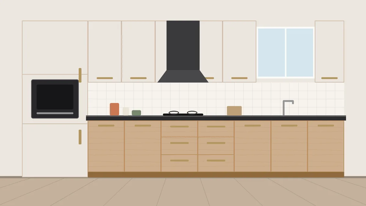
Pearl greige and light maple
Two light, warm tones that make a small 2 BHK kitchen feel bigger without the starkness of pure white.
- Opens up small kitchens
- Hides daily wear better than white
- Broad resale appeal
- Needs good handles and lighting to come alive
- Wood-grain quality matters here most
- Can look plain if under-styled
- Kitchen size
- Small (best)
- Daylight needed
- Low to medium
- Style
- Modern, transitional
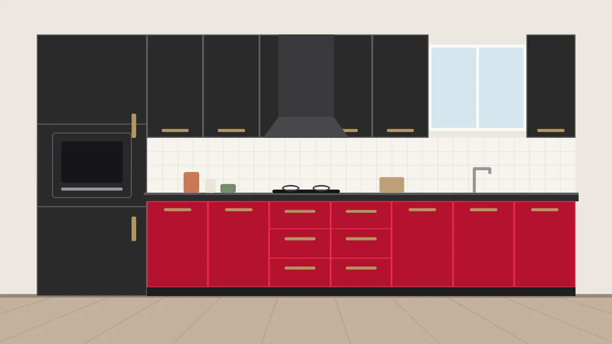
Graphite and signal red
For a keen cook who wants the kitchen to be the heart of the home. Red on one island or tall unit only, graphite everywhere else.
- High impact from a small red area
- Hides cooking marks
- Strong character
- Needs a large, bright kitchen
- Red laminates vary widely; sample several
- Harder to resell; choose it for living, not flipping
- Kitchen size
- Large
- Daylight needed
- High
- Style
- Bold modern
Quick decision table
Find the row that describes your kitchen. The pairs listed are the ones we would start with; others are not wrong, just not the first choice.
| Your kitchen | Start with |
|---|---|
| Small and fairly dark | Pearl greige and light maple · Warm white and walnut |
| Small but sunny | Ivory and sage · Chalk white and graphite |
| Medium, average light | Warm white and walnut · Chalk white and graphite · Linen beige and forest green |
| Medium, bright, want a statement | Soft white and ink navy · Sand and terracotta · Concrete grey and ochre |
| Large with plenty of daylight | Charcoal black and oak · Soft white and ink navy · Graphite and signal red |
| Open to the living room | Warm white and walnut · Ivory and sage · Linen beige and forest green |
| Heavy Indian cooking every day | Sand and terracotta · Charcoal black and oak · Pearl greige and light maple |
| Planning to sell within 7 years | Warm white and walnut · Pearl greige and light maple · Chalk white and graphite |
| Want something unusual | Linen beige and forest green · Sand and terracotta · Graphite and signal red |
Two rules sit behind the table. Size: small kitchens look larger with light, reflective colours on the wall units; save dark shades for the base units or a large kitchen. Light: a kitchen with strong daylight can carry olive, charcoal or navy, while a kitchen with one small window needs creamy whites, soft sage or pale beige to avoid a dim, heavy feel.
Matte, gloss or textured?
The same colour in three finishes gives three different kitchens.
- Matte: the best all-rounder for cooking kitchens. Dark colours look richer in matte and forgive more.
- Gloss: useful on light-coloured wall units in small kitchens, where reflection helps. Avoid it on base units, which take the most grease and knocks.
- Textured (suede, woodgrain, fabric): makes wood looks and greens convincing. Slightly dearer, and worth it on the colour that leads your scheme.
Six mistakes we see often
- Choosing under showroom lights. Showroom LEDs flatter everything. Take three or four samples home and look at them on the wall at the times you cook.
- Gloss everywhere. It looks wonderful for two weeks. Limit gloss to one element at most.
- Matching cabinet wood to floor wood. Two similar woods fight. Go clearly lighter or clearly darker than the floor.
- Ignoring the handles. Hardware is the accent that finishes the scheme: brushed brass warms, matte black sharpens, chrome cools.
- Trusting the catalogue colour. Greens, navies and reds vary widely between brands and finishes. Always see the real sheet.
- Matching laminate to wall paint. They reflect light differently and never match exactly. Aim for a related tone, not a copy.
Once the colours are settled, price your layout in the modular kitchen calculator.
Frequently asked questions
Which two-colour combination suits a small Indian kitchen?
Light, warm pairs such as pearl greige with light maple, or warm white with walnut. They keep the room open and hide wear better than pure white. Avoid dark combinations unless the kitchen gets strong daylight.
Should the dark colour go on top or bottom?
Bottom, in most kitchens. Lower cabinets take more splashes and knocks, and a darker base grounds the room while lighter uppers bounce light. Reverse it only in large, bright kitchens where you want drama.
Are dark laminates harder to maintain?
Dark matte laminates hide oil and small scratches well. They do show hard-water spots and dust more than mid-tones, so wipe them with a dry microfibre cloth.
Can I use three colours?
You can, but it usually looks busy. Most good three-colour kitchens are really two colours plus a small accent, such as a wood tall unit, a coloured island or a patterned backsplash.
How long does a laminate kitchen last?
A good 1 mm laminate on the right board, properly edge-banded, looks good for 10–12 years or more of daily use. Edges and joints near the sink usually show wear first.
Should laminates match the countertop?
They do not need to match, but their undertones should agree: warm laminates with warm stone, cool laminates with cool stone.
✓ Sent